


My color wheel
My color wheel


The awesome Julie Fei-Fan Balzer is doing a series of twelve "mini" online classes this year called the Getting Started Series. I love Julie's online classes - you might remember her stamp carving 101 class from this post or this one or her 30 days in your journal class from these posts. In the Getting Started series she is running this year, there is one class on one topic each month and the first one is on Color Mixing.
I don't have any formal art background - in fact after forced weekly trips to art class in elementary school ended, I never took another art class again until the last two or three years when I started taking them for my own interest and enjoyment. One of the things I've struggled with in all of those classes is color mixing. I've found myself buying tubes of very specific colors because all of the color mixing shown in the videos just alluded me. When I've done Wine and Canvas classes here in town (you can see work from those here, here, and here), the color mixing part has always been something that I've struggled with. So, I decided the Color Mixing class would be great for me.
There are seven videos in the class that are very short and easy to watch. The main "exercise" suggested in the class (there is loads of other inspiration given for applying to your art projects) is to create a simple color wheel. However, in the lesson on tinting, toning, and shading, there was an image of a color wheel with the a broader spectrum of hues - so I decided to try to recreate that using simple acrylic paint. And, I'm very pleased with how it turned out. With only five tubes of paint (primary red, primary blue, primary yellow, black, and white), I created all of the different shades you see here.
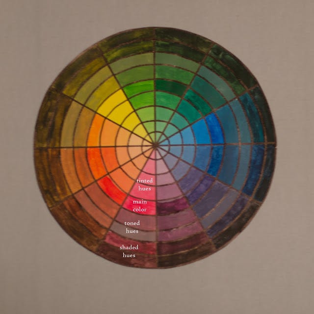
If you start in the center and work your way to the outer ring, the first four rings moving from the center to the outside are the tinted hues. The fifth ring is the main color you'd find at the point on a traditional color wheel. The next two rings moving out from that (rings six and seven) are the toned hues, and the final two rings are the shaded hues.
Here's how I did it if you want all the details.
I used a 9 x 12 piece of acrylic paper. That made it easy to adjust my compass to make a 9" circle to start and then each of the inner circles is just set a half inch smaller than the previous circle (using the measurements on my compass). Julie has a tutorial in the class for creating the circle for a simple color wheel and dividing it up into the segments without a compass or a protractor. The math nerd in me knew it would be easier to just grab those handy tools and divide my circle in 12 equal sectors that measured 30 degrees each.

You can't really see it all that well in the photo above, but I labeled the outer edges where the primary and secondary colors should go (you might notice a little scribble on the top left - that says "purple"). Then I also added, in the fifth ring in from the center, a little penciled in X (which I then erased before I painted over that specific segment) to remind me where the main color when in each segment.
Now, it was time to bring on the paint. You only need five colors to create all 108 (!!!!) hues you have in the finished project.

Look at that nice clean palette...it had no idea what carnage was about to waged on its surface. If you're wondering, the palette was a Christmas gift to myself. It's the 16 x 24 inch Tri-Art Palette which I got from Dick Blick with a coupon and free shipping. This was the first time I'd use it and it was amazing. I had plenty of space to mix everything and this morning, the dried paint peels right up - no washing palettes at midnight and never getting all the already dried paint off. Speaking of dried paint...
I started by laying out a big glob of each of the five colors. While I do think it's important to lay down the primary red, primary blue, and primary yellow on your wheel to start with - just to give yourself some good reference points in the big 'ole wheel of confusion (you can see that I did that on the in progress shot below) - if I did this again, I'd only squeeze a little of each of those on to my brush to lay down those sectors and then would start with just two colors at a time (making the hues from the red and blue combined or the red and yellow combined first). I did the hues using yellow last and my yellow paint had already developed a little crust on it because it had been out long enough the air had dried the little blob a bit. Live and learn...
I did all the hues for a single color after I mixed that color...and for some reason I left the primary colors until last. I started with purple, put that down in its little sector and then went on to do the tinting of the purples, then I toned, and then I shaded. Then I mixed up red-violet, rinse and repeat and then blue-violet and rinse and repeat. At that point, I cleaned up any remaining paint on my palette by brushing it down on a clean art journal page so, for instance, I have one big two page spread that has nothing but colors from the three wedges around purple. I also kept a tag handy as I was working on each set of wedges to clean my brush off onto, as I did a lot of mixing with my brush. My big "tip"...the other thing I found handy for "scooping" paint from one blob to another was a piece of a hotel key card. I keep all of the hotel key cards (as well as used up gift cards) in a little container in my studio for just such a purpose. I grabbed one, cut it into a few strips and used them for scooping, scraping, and mixing.

The last three wedges that I did were the hues for red, blue, and yellow. If you're wondering about the weird extra yellow splotch in the shot above - I messed up...literally seconds into the project. Even with my little penciled-in x's to remind me which sector the main color went in, I got excited and started putting yellow in the wrong sector. I wiped off as much as I could with a paper towel and then just painted over it with the first tinted shade. Even up close, you can't really tell there was a "mistake" made only moments after starting when you look at the finished product.
Speaking of finished products...this is how it looked with all the painting done.

This took a lot of time - and I did it all in one night. If I had just started with two primary colors, I probably would have felt as though I could stop at any time after a color was done and pick it up again another day. However, because it was Friday night so I didn't have to get up early and because I just like to see things done, I did finish it all up in one evening. All in all, it's probably about three hours of work but that included frequent breaks to let the dog in and out, scratch the cat's head, get something to drink, and, of course, get distracted by any number of things in my studio. I add that only to say - it's not hard work and you could leave it and come back to it at any time...I just chose not to do so.
I felt like it needed a little "framing" in order to feel finished so I grabbed my big thick point sharpie and a ruler and drew in the lines between all the wedges. Then, in an act of after midnight bravery, I free handed all the circles back in. It wasn't hard - just do one sector at a time and follow the light pencil line that you could still see through the paint in a number of places. I cut along the outer circle and spray mounted the finished circle onto a piece of 12 x 12 neutral colored card stock. Because I'm kind of proud of my little color wheel - here is that finished product picture again - this time without the labels.

I think I'm going to add some writing or lettering to the page and frame it and hang it in my studio as I'm pretty proud of how well it turned out and I like the color inspiration it provides.
Have you taken on any crazy, late night art adventures? Does color mixing befuddle and confuse you? Any big things you want to learn about in the new year like color mixing or some other arty topic?